Bootstrap项目实践:带有导航栏的响应式网页
发表时间:2020-10-18
发布人:葵宇科技
浏览次数:27
前言
对前端开发不是很熟练,之前学过html和Javascrip课程但是掌握的并不是很熟练,希望能够借助Bootstrap课程巩固前端课程。
上一篇:Bootstrap项目实践:Grid布局应用
提示:以下是本篇文章正文内容,下面案例可供参考
一、Grid布局和Flex弹性盒子
https://www.runoob.com/bootstrap/bootstrap-grid-system.html
这次也是用到Grid进行整体布局,在局部使用Flex弹性盒子进行局部布局。代码很简单,基本一看就懂。
二、Flex弹性盒子展示
https://www.w3cschool.cn/css3/2h6g5xoy.html

简单的来说,弹性盒子就是使盒子内的内容不会超出盒子范围泄露出去。根据对弹性盒子的应用我们可以在盒子里面布局更好的符合响应式开发。
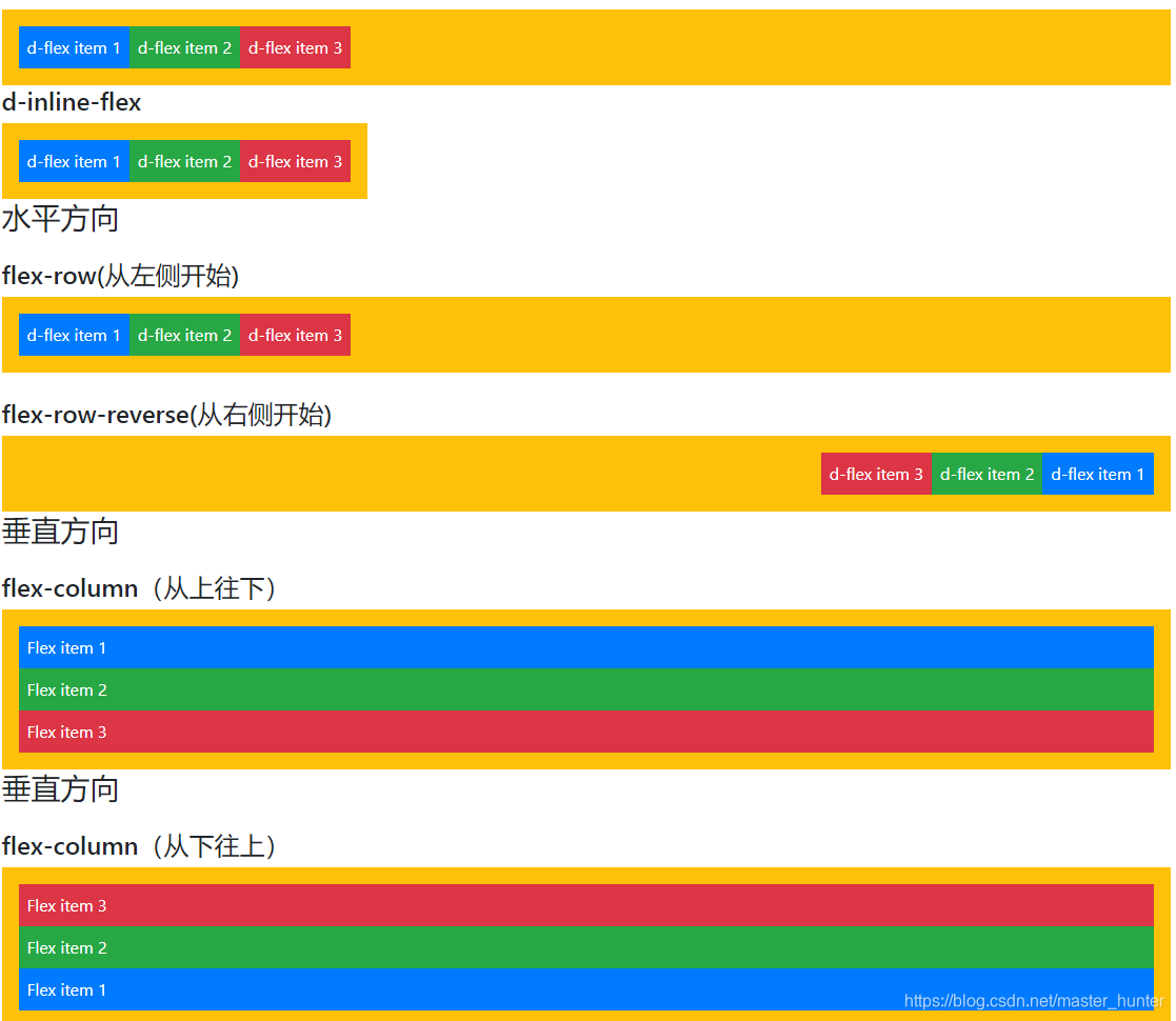
这里先展示一下盒子的基本用法:
<!doctype html>
<html>
<head>
<meta charset="utf-8">
<meta name="viewport" content="width=device-width, initial-scale=1,  shrink-to-fit=no">
<title>弹性盒子展示</title>
<link rel="stylesheet" href="bootstrap-4.2.1-dist/css/bootstrap.css">
</head>

<body class="container">
<h3 class="mb-4">定义弹性盒子</h3>
<h4>d-flex</h4>
<div class="d-flex p-3 bg-warning text-white">
	<div class="p-2 bg-primary">d-flex item 1</div>
	<div class="p-2 bg-success">d-flex item 2</div>
	<div class="p-2 bg-danger">d-flex item 3</div>
</div>
<h4>d-inline-flex</h4>
<div class="d-inline-flex p-3 bg-warning text-white ">
	<div class="p-2 bg-primary">d-flex item 1</div>
	<div class="p-2 bg-success">d-flex item 2</div>
	<div class="p-2 bg-danger">d-flex item 3</div>
</div>
<h3 class="mb-4">水平方向</h3>
<h4>flex-row(从左侧开始)</h4>
<div class="d-flex flex-row p-3 bg-warning text-white">
	<div class="p-2 bg-primary">d-flex item 1</div>
	<div class="p-2 bg-success">d-flex item 2</div>
	<div class="p-2 bg-danger">d-flex item 3</div>
</div><br/>
<h4>flex-row-reverse(从右侧开始)</h4>
<div class="d-flex flex-row-reverse p-3 bg-warning text-white">
	<div class="p-2 bg-primary">d-flex item 1</div>
	<div class="p-2 bg-success">d-flex item 2</div>
	<div class="p-2 bg-danger">d-flex item 3</div>
</div>
<h3 class="mb-4">垂直方向</h3>
<h4>flex-column(从上往下)</h4>
<div class="d-flex flex-column p-3 bg-warning text-white">
	<div class="p-2 bg-primary">Flex item 1</div>
	<div class="p-2 bg-success">Flex item 2</div>
	<div class="p-2 bg-danger">Flex item 3</div>
</div>
<h3 class="mb-4">垂直方向</h3>
<h4>flex-column(从下往上)</h4>
<div class="d-flex flex-column-reverse p-3 bg-warning text-white">
	<div class="p-2 bg-primary">Flex item 1</div>
	<div class="p-2 bg-success">Flex item 2</div>
	<div class="p-2 bg-danger">Flex item 3</div>
</div>
</body>
</html>
展示效果:
三、导航栏制作
根据上述弹性盒子展示的效果,不难发现可以利用Gird的布局划分col4份预留给我们的表单空间。然后利用flex的纵向排布作为我们表单格式。
<!doctype html>
<html>
<head>
<meta http-equiv="Content-Type" content="text/html; charset=utf-8" />
<meta name="viewport" content="width=device-width, initial-scale=1,shrink-to-fit=no" />
<title>弹性盒子表单测试</title>
<link rel="stylesheet" href="bootstrap-4.2.1-dist/css/bootstrap.css" />
<link rel="stylesheet" href="font-awesome-4.7.0/css/font-awesome.css" />
</head>
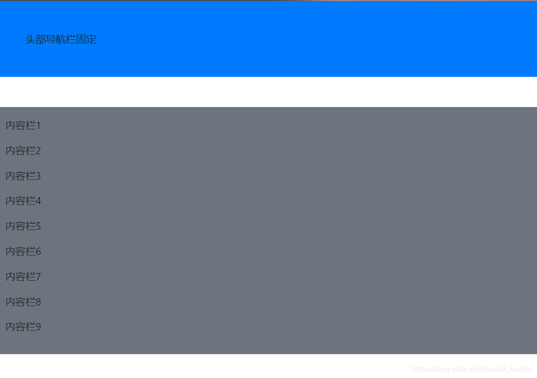
<nav class="sticky-top bg-primary p-5 mb-5">头部导航栏固定</nav>
<div class="bg-secondary p-3">
<p>内容栏1</p>
<p>内容栏2</p>
<p>内容栏3</p>
<p>内容栏4</p>
<p>内容栏5</p>
<p>内容栏6</p>
<p>内容栏7</p>
<p>内容栏8</p>
<p>内容栏9</p>
</div>
<body>
</body>
</html>大概是这个形式:
在进行修饰一下就行了。
四、Grid布局
将导航栏和所展示的内容分开来。
<div class="col-12 col-md-4 border py-3">
<div class="col-12 col-md-8 border py-3">
超过中屏就展示导航栏和内容,小于中屏就只显示上面是导航栏下面是内容。
五、整体实装
我写的是关于学院学生活动的一个导航栏响应网页。

左边为导航行,利用锚点导航,左边顶部为固定定位,点击可回到顶部。过多内容将不作太多设置,仅作展示。
附上源代码:
 <!doctype html>
<html xmlns="http://www.w3.org/1999/xhtml">
<head>
<meta http-equiv="Content-Type" content="text/html; charset=utf-8" />
<meta name="viewport" content="width=device-width, initial-scale=1,shrink-to-fit=no"  />
<title>带有导航栏的响应式网页档</title>
<link rel="stylesheet" href="bootstrap-4.2.1-dist/css/bootstrap.css" />
<link rel="stylesheet" href="font-awesome-4.7.0/css/font-awesome.css" />
</head>

<body class="container" style="height:2000px;">
<div class="row">
<div class="col-12 col-md-4 border py-3">
	<nav class="sticky-top bg-primary  p-5 mb-5"><a href="#topAnchor"><p class=" text-white">软件学院2020年活动</p></a></nav>
<nav class=" bg-danger p-3 ">
	<a href="#new1"><p class=" text-white">众星捧月美好时,举国欢庆悦团员</p></a>
    <a href="#new2"><p class=" text-white>如果学到了或者用到了~~~求个赞吖~~